
Tech companies and their logos are growing at a magnifying speed. And why wouldn’t they? The future is all about information technology, and so is the present. Even if you talk about software or applications today, it might be prevalent but not as progressive since the world is moving towards technologies like blockchain and the internet of things; where machine learning is the driving force. All in all, these giant corporations fall under the umbrella of technology firms.
As of today’s day and age, Apple accounts to a value of $2.35 trillion, which makes it the top digital company of the world. So, have you ever wondered what goes behind the establishment of these firms?
Well, communication and thorough engagement that builds a concrete trust amidst the company and the consumers is the key. However, what shouldn’t be neglected is the power of a groundbreaking logo; don’t you mesmerize the logos of these companies? If you want to explore more to get some inspiration for your online logo maker tool, then this is exactly where you should be!
1. Google
The 23 years old search engine giant, Google is surely one of the top companies in the world. With its most advanced and innovative way of operating its company for the employees as well as for the users, it is the kind of information of any sort and type, and anytime that you wish. If you assess the transformation of its logo then it has not devised any massive change into their logo which might make the users wonder what it is. In a crux, the logo has been changed only twice because the need to modify it hasn’t arrived yet. Besides, the color key is attractive, and the alteration derived in the logo has been nothing more than giving it a less contrasted look in terms of colors and making it enhanced digitally, with an opacity.
2. Twitter
If you are an opinionated soul who has a take on anything and everything, then you must have experienced life on Twitter. Being one of the most intriguing social media networks, this platform is admired by all. About its logo, don’t you think how thoughtful and meaningful it is? Without a doubt, the history of their logo has come a very long way as it has tremendously changed from what it was in the beginning.
In the year of its birth, the logo was a wordmark. Four years later, the bird mark was introduced with the company name. Years later in 2012, the logo reformed to such an extent that not only was the word mark eradicated but the bird icon was also modified into a more refined version of it. Now what many don’t notice is that with growth, these alterations become necessary; today the color of the Twitter logo is darker than its previous versions.
3. Dell

Being one of the many progressive technology companies, Dell is known for producing, maintaining, and fixing the computer products. This IT company was founded back in 1984, and since then it has made its way into the world of top firms that sell its products across the globe. Highlighting its logo, it is certainly the one which decodes a hidden meaning to it.
When you take a glance at it, you will see that the letter ‘E’ is tilted, and slightly more rotated than the other letters; ever wondered if that is the case? Well, the truth is that the founder of Dell aimed to ‘turn the world on the brand’s ears’, which is a famous brand strategy. Another great change would be taking a shift from black to blue that indicates trust and reliability.
4. Facebook
Do you remember a time when everyone would rave about this social media site, like the world was ending and everyone had to stay touched, updated and what not. As life keeps on moving forward, every other person would have nostalgic memories with Facebook and seeing it flourish makes one rejoice. The blue color that you see on Facebook radiates a positive vibe, giving the users a smooth experience with confidence and integrity. However, this hasn’t stayed the same and the logo has changed a couple of times, focusing on the various shades of blue. Today, the logo is of a lighter shade in blue with a white ‘F’.
5. Microsoft
One of the oldest tech companies, Microsoft has seen the world around them revolving every now and then. When it is about their logo, the one you see today is not the one that was present years ago. In fact, it has changed multiple times. During the black and white era, the word mark was black on a white background. Gradually, it changed into a four-color window with some edges and now it is a more digital version which makes it vibrant and modernized at the same time.
6. Apple
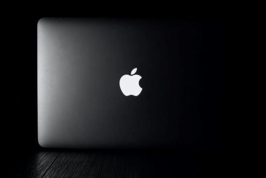
Apple is a multinational technology company operating in the consumer electronics, computer software, and online services sectors. As of January 2021, Apple ranked the highest on the list of the world’s most valuable companies by revenue. It was Ronald Wayne who created the first Apple logo back in 1976. The falling apple symbolizes Isaac Newton’s gravity discovery in this logo. But the logo was quite complex to comprehend and lacking in both simplicity and clarity. Which led to its replacement shortly thereafter.
The second logo was designed by Rob Janoff. Janoff explained this in an interview with The New York Times in 2009. Because of its bite, Apple logos are always depicted as apples, not cherry logos. But why apples? In his youth, Jobs worked in an orchard. So he used the name MacIntosh for his computer as a tribute to his favorite apple variety. The black two-dimensional logo Steve Jobs used in the 2000s has finally been adopted after numerous trials. Other versions include white and grey. Logos such as this one are versatile since they can be used on devices, websites, and storefronts alike.
The Final Thought
It is imperative to understand the basics of a logo before finalizing the draft. Besides, it should be made clear that designing logos for large corporations requires more attention, and investment of time and effort.
I am an American tech enthusiast and professional writer who is passionate about innovation, design, and digital marketing. As an author, I strive to create content that is interesting, engaging, and valuable to my audience.
-

1 Best Logo Maker and Creation Tools
-

2 How to Successfully Build a Start-up Business from Scratch in 2022?
-

3 The Best Email Finder And Scraper In 2022
-
4 Steps to find a good digital marketing consultant
-
5 Digital Marketing And Its Benefits In Modern Day Industries
-
6 Many Different Career Paths of a Graphic Designer
-
7 The Student’s Handbook to Digital Marketing Training
-
8 Is Your Dental Marketing a Campaign or Commitment?
-
9 Are there actually any decent free logo-maker tools on the Internet?
-
10 Top 5 Reasons To Hire A Top Seo Company Like SEOcontrol Kolkata